

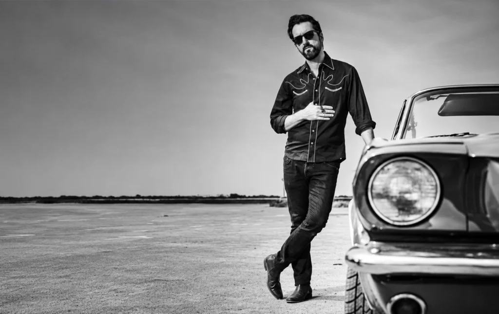
If you have come across a print full of saturated reds, gleaming yellows and deep blues, with a wink at a sixties album sleeve or a Bond film, there is a good chance it was by Marcos Torres. Born in Ibiza in 1973, he has spent more than fifteen years as an independent artist building a world of his own: deliberately fantastic, ruled by colour and visual impact, and deeply rooted in music iconography, cinema and pop mythology.
The writer and journalist Blanca Lacasa once summed him up in a string of images. If his work were music, she wrote, it “would be pure sixties psychedelia”; if it were a pair of shoes, they would be blue suede; and if it were a character, it “would probably have been written by Ian Fleming”.
From galleries to T-shirts
His work has been exhibited in Ibiza, Madrid, Santiago, Castellón, Mallorca and León, and abroad in Brighton, London, Stuttgart, Hamburg and Copenhagen. It has featured on Spanish television programmes such as Cuatrosfera, Ipop and Básico, and in publications including El Mundo, Vogue, EP3, Rolling Stone, Mondosonoro, Marie Claire and Harper’s Bazaar.
He has never kept to the gallery wall. His collections of artist’s T-shirts, a natural home for popular art, sit alongside record sleeves, book covers and film title sequences, and he designed the official T-shirts of the Guggenheim Museum Bilbao.
Why silkscreen
At the heart of it all is screen printing. Asked early in his career why he had chosen it, he said nothing else could match its quality and intensity of colour: “That intensity in the reds, the extraordinary brightness of the yellows, the depth of the blues… Those are real colours!” He is in good company: Warhol, Lichtenstein, Kandinsky and Miró all relied on the technique for much of their graphic work.
Each print is made by hand, in a painstaking process in which the artist works side by side with the printer, and which demands specialist skill, great precision and years of experience.
Graphic Design & Corporate Identity for two Ibiza hotels
On the island, his work can also be seen on a much larger scale: Torres was in charge of the graphic design and corporate identity of two hotels run by Concept Hotel Group.
Hotel Paradiso, in the Port des Torrent area and billed as Ibiza’s first art hotel, set out to be provocative in every detail, with an extreme take on Art Deco by the architect Michele Corbani and the interior designer Andrea Spada. From the very first sketches, its graphic language was conceived as a statement of intent: a celebration of art and design meant to stimulate the senses wherever guests look.
Hotel Cubanito, in Sant Antoni, very close to Cala Gració beach, is an Art Deco building with colonial-style interiors inspired by Little Havana, and called for a playful, suggestive mood. Torres’s studio gave the hotel a voice of its own, drawing on Cuban Spanish for its signage and printed material. The visual style is colourful and energetic, rich in textures and typefaces and with nods to revolutionary graphics, so that the architecture, interiors and graphics come together as a tribute to Cuban culture.